
Designing a Portal People Return To: One Page, Four Things
Thursday, 14:10, at Redbrook Engineering. Owen has been asked to "make the portal better" after a week of asking people why they e-mail. Most of them said they had tried it once. He opens it on a borrowed laptop and looks at it the way a new starter would. A banner cycles through three announcements, one of them about a printer that was replaced long ago. Below that, a welcome message from the IT manager. On the left, a service catalogue with forty-one entries, alphabetical, beginning with "Access Request (Standard)". On the right, a news column, a satisfaction widget and a link to the IT strategy. The search box is below all of it, past the fold, in a grey that matches the background. Owen counts nine things on the page that do not help anyone get anything, and one that does, and the one is hidden.
A portal people return to is a page that answered them last time, quickly, and looks like it will again. That is a design property, not a marketing one, and it comes from a simple fact about visitors. Every one of them arrives with one of three intentions. They want to find an answer, they want to ask for something, or they want to know what has happened to the thing they asked for. A page that serves those three intentions, in that order, with nothing in the way, gets returned to. A page that serves the desk's wish to be seen as busy and strategic gets visited once. This article is part of our Self-Service Portal Adoption series, and it is about the page.
It covers the three intentions and the four things that serve them, then one search box above everything. Next come the top ten questions, the request form that takes a minute, and the status of my tickets. The article covers no login friction and what to leave off, with a table. It finishes with testing the page on three people before anyone else sees it, a short war story, and the portal page layout to copy. These come in that order.
One Page, Three Intentions
The portal is one page, and the page is built from four things, because three intentions need four things to serve them. A search box finds the answer. A short list of the commonest questions finds the answer for the person who did not know what to search for. A request form asks for something. A list of the visitor's own tickets, with their status, tells them what has happened. Everything else a portal might carry, and there is a great deal it might carry, either serves one of those three intentions or belongs somewhere else.
The order on the page is the order of the intentions, weighted by how often each arrives. Most visits are looking for an answer, so search goes at the top, full width, in the first place the eye lands. The commonest questions sit directly beneath it, because a person who cannot think of the right word can still recognise their problem in a list. The request form sits beside the list, for the person whose problem is not in it. The visitor's tickets sit along the bottom. The person checking on a ticket already knows what they are looking for and will scroll for it. The person with a new problem must not be made to scroll past old ones.
The picture below is the page as a sketch, with the four things numbered in the order a visitor needs them. The search box runs across the top with example searches in it, so that nobody has to guess what kind of words it wants. The top questions are on the left, drawn from last quarter's tickets. The request form is on the right with three fields and a note that it takes about a minute. The visitor's tickets are along the bottom, each with a status, a named person and a time. There is no banner, no news, no welcome message and no catalogue, and the page fits on one screen without scrolling.
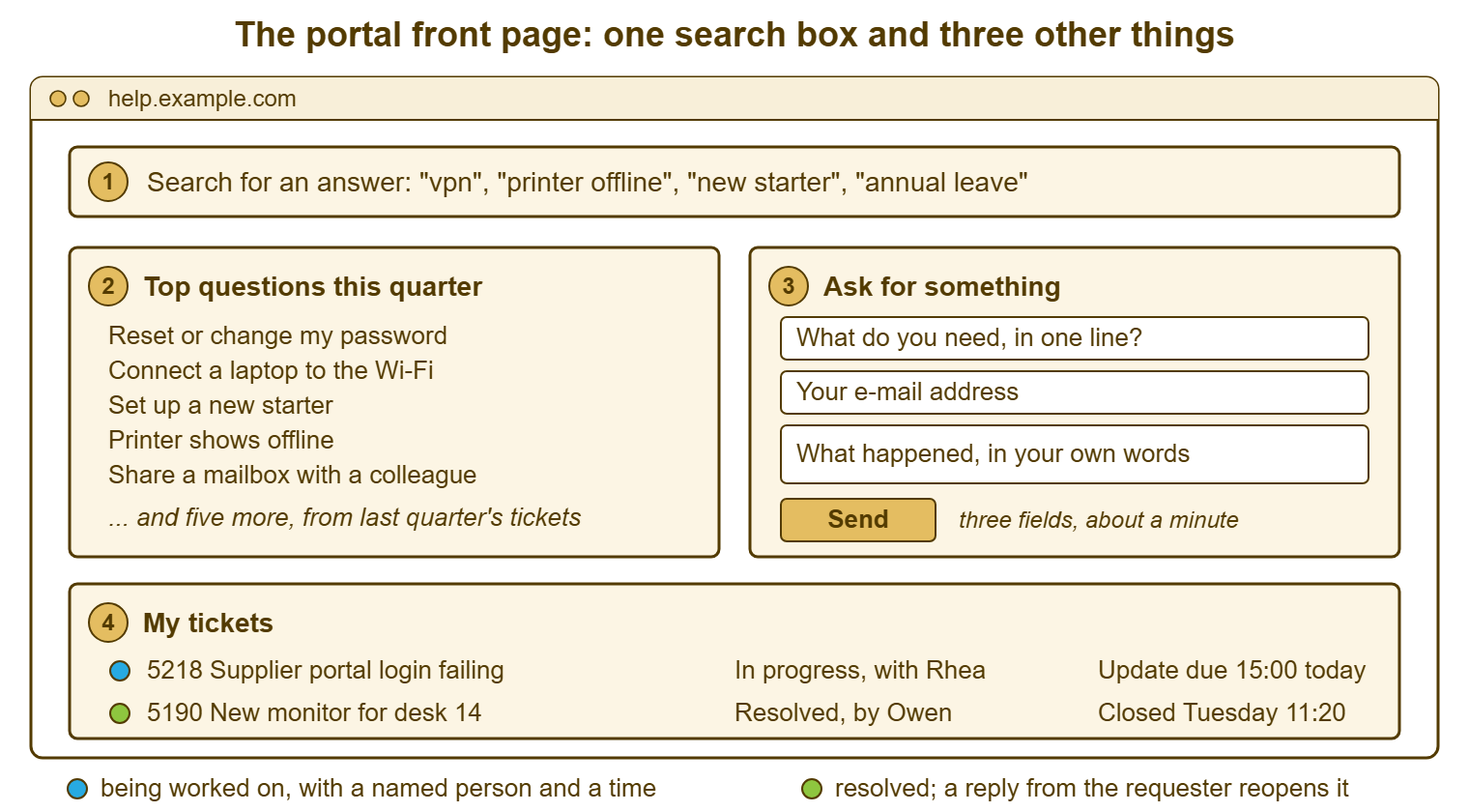
The sketch is deliberately plain, because plain is what returns people. A visitor who found the answer in fifteen seconds last time will come back for the next one. A visitor who had to work out which of nine panels was the real one will remember the working out, not the answer. And the next time they will e-mail. The whole design question is which of those two memories the page creates. Almost every element that is not one of the four pushes it toward the second.
One Search Box, Above Everything
The search box is the portal. Everything else on the page exists for the visitor the search did not serve, and the search should serve most of them. It goes at the top, full width, with the cursor already in it when the page loads. That lets a person type before they have read anything. The box itself should show examples of the words it expects, in grey, inside it: "vpn", "printer offline", "new starter", "annual leave". Examples do two jobs. They tell a nervous visitor that short, ordinary words are fine. And they quietly tell everyone that the portal knows about printers and leave, which is more reassurance than a banner ever gave.
What the box searches matters as much as where it sits. It should search the knowledge base, the written answers the desk has published, and ideally the visitor's own tickets too. The aim is for "monitor" to find both the article on connecting a second screen and the ticket the visitor raised about one last week. It should match the words people use rather than the words the desk uses. "wifi", "wi-fi" and "wireless" all find the same article, or the article has all three in its title. Most tools search titles and bodies; some search only titles; check yours by searching for a word that appears only in an article's body. If it is not found, every article's title needs the words a requester would type.
The result that matters most is the empty one. A search that finds nothing must not end at "no results", because that is the portal declining to help and the visitor will take the hint. The empty result shows the request form, pre-filled with the words they searched. It adds one line: "No article yet. Tell us what you need and we will answer you directly." The search failed; the visit did not. How search answers before a ticket is raised, and how to tune it, is the subject of Search That Answers Before the Ticket. The design rule here is simply that the box is first, wide, and never a dead end.
The Top Ten Questions
The list under the search box is for the person who does not know what to type. Someone whose laptop will not join the network may search "internet", "wifi", "connection" or "network". They may search nothing at all, because they are not sure what the problem is called. A list of ten plain questions, in the requester's words, lets them recognise their problem instead of naming it. "Connect a laptop to the Wi-Fi" is recognised by everyone with the problem, including the people who would have searched for the wrong word.
The ten come from the tickets, not from the desk's opinion. Pull last quarter's tickets, group them by what the requester wanted, and take the ten largest groups. On most desks the list writes itself. It includes the password reset, the Wi-Fi, the printer that says offline, the new starter, and the shared mailbox. It also includes the second screen, the software install, the phone, the leaver, and the room booking screen. Each line links to one article that answers it. If the article does not exist yet, writing it is the next job, in the order the list gives. That is the whole argument of The First Twenty Articles. The list is a to-do list for the knowledge base as much as a menu for the visitor.
Ten is the number. Not forty-one, which is a catalogue; not three, which looks like the desk gave up. Ten fits in the space beside the form without scrolling. Ten is about as many as a person will read before deciding the list does not have their problem and moving to the form. That is the right next move. Refresh it every quarter from the tickets, and date nothing on it. A list headed "Top questions this quarter" is always current. A list headed with a month is wrong eleven months a year.
The Request Form That Takes a Minute
The form is for the person the search and the list did not serve, and its only job is to get the request in. Three fields: what do you need, in one line; your e-mail address; what happened, in your own words. A button that says "Send". A line beside it says it takes about a minute, because it does. Saying so is the difference between a visitor who starts and one who e-mails instead. The desk would like to know more beyond those three: the device, the building, the urgency, the category. Those are asked at triage by a person who knows what the answers mean.
The argument for three fields and the way to defend them against the people who want eleven is made in A Request Form People Will Finish. This article does not repeat it. The design rule for the portal page is narrower. The form is visible on the front page, not behind a link called "Submit a request" or behind a catalogue. It is not behind a choice between "incident" and "service request" that the visitor cannot make. A visitor who has to classify their problem before describing it will describe it to the mail client instead, which asks no questions at all.
When the form is sent, the next screen is part of the design and usually the most neglected part. It shows the ticket number and the first line of what the visitor wrote. A sentence says when they will hear from a person: "Ticket 5218. A technician will reply by 15:00 today." Not "Thank you for your submission", which tells them nothing and sounds like a vending machine. The confirmation is the first promise the portal makes. And a visitor who gets a time will come back to see whether it was kept, which is the beginning of a return visit.
The Status of My Tickets
The bottom of the page lists the visitor's own tickets, open ones first, each with four things. Each has the number and the subject in the visitor's words. It has the status with a person's name and the time of the next update or the last one. That is the whole list. The list exists because the third intention, "what has happened to my request", otherwise becomes a chasing e-mail, a phone call or a walk to the desk. A visitor who can answer it in five seconds on the portal stops doing those things.
The status line is where most tools and most desks fail the visitor, and it is worth being precise about why. A status of "Open" tells the requester the ticket exists, which they knew, because they raised it. "In progress" tells them a little more and still not what they came for. What they came for is the answer to three questions: did you get it, who has it, and when will I hear? That is the argument of What Users Actually Want to Know. The ticket list answers them when it shows a name and a time: "In progress, with Rhea, update due 15:00 today." The status word is the tool's; the name and the time are the desk's, and they are what makes the list worth returning to.
The list also needs a way to reply. A requester with new information or a question must be able to add it to the ticket from the page. They should not have to start an e-mail thread beside it. A reply from the requester belongs in the ticket's history, where the technician will see it. A reply to a resolved ticket should bring the ticket back rather than vanish into a closed record. Most tools reopen on a requester reply. Some do not, and the behaviour is worth testing before the page goes live. A resolved ticket that cannot be answered is a conversation the desk ended by walking away.
No Login Friction
The page must open without asking for anything. A login screen between the visitor and the search box is the single most effective way to end a visit. The visitor came with a problem and is now being given a second one. Many people have no idea what their portal password is, because they were never told they had one. Many more are on a shared machine, a phone, or a laptop that has just stopped working, which is why they came. A login is a door, and the whole design brief of this page is to have no doors.
There are two acceptable ways to know who the visitor is. The first is that the page simply does not need to know until the visitor asks for something. At that point it takes an e-mail address on the form and uses it to find their tickets. Search and the top ten need no identity at all. The second is a silent sign-in from the directory. With that sign-in, a person already logged in to their work machine arrives on the portal already recognised, with their tickets showing and no prompt. The silent kind is fine where it is genuinely silent. The kind that opens a second window and asks for the password again is a login screen with extra steps. If you run QuerySolv, requesters need no account to use the portal, so the wall is not one you have to dismantle before you start.
Test the page from the worst position a visitor could be in. Try a phone on the car park Wi-Fi, a shared terminal in the warehouse, and a laptop that was reset last night. If the search box appears and works from all three without a prompt, the page is open. If any of them asks for something the visitor may not have, that is the first thing to fix. It comes before the content and before the form, because it stops the visitor seeing either.
Remember: every element on the portal page serves one of three intentions: find an answer, ask for something, or check on something. Anything that serves none of them goes somewhere else, however important it is to the desk.
What to Leave Off
Everything else is what to leave off, and there is a lot of it, because a portal page attracts content the way a notice board does. Each item arrived for a reason. The banner was added for the outage last winter and never removed. The welcome message was the IT manager's idea. The catalogue came with the tool. The news column was somebody's project. The satisfaction widget was a request from the quarterly review. None of them is bad. All of them stand between a visitor and the search box, and the visitor will not thank anyone for the opportunity to read them. I once ran a portal with a "latest news" column, and the latest news was eleven weeks old when I removed the column. Nobody noticed either event.
The table lists the usual candidates, which of the three intentions each serves, and where it goes instead. The test for every item is the same. Does a visitor with a broken screen, a request or a question get to their answer faster because this is on the page? If the honest answer is no, it moves. Most of the items have a better home than the portal anyway. There they will be read by people who want them rather than skipped by people who do not.
| Element | Serves which intention | Verdict | Where it goes instead |
|---|---|---|---|
| Search box | Find an answer | Keep, top, full width | Nowhere else; this is the page |
| Top ten questions | Find an answer | Keep, under the search | Refreshed quarterly from the tickets |
| Request form, three fields | Ask for something | Keep, on the front page | Not behind a link or a catalogue |
| My tickets with status, name and time | Check on something | Keep, along the bottom | Open tickets first |
| Current outage notice | Find an answer, during an outage only | Keep as one line, only while an outage is live | Removed the hour the outage ends |
| Announcement banner or carousel | None | Remove | The all-staff channel or the status page |
| Welcome message, mission statement | None | Remove | The IT page on the intranet |
| Full service catalogue, forty items | Ask for something, slowly | Remove from the front page | A link under the form: "see everything we offer" |
| News column | None | Remove | The intranet |
| Satisfaction survey widget | None | Remove | The e-mail sent when a ticket is resolved |
| Links to other teams' portals | Ask for something, elsewhere | Remove, or merge the portals | One front door for every department |
| Contact phone number and hours | Ask for something, by another route | Keep, one line, bottom | Small, because the page is the route |
Two rows deserve a word. The outage notice is the one piece of news that belongs on the page. During an outage "find an answer" means "is it just me". One line at the top answers it for everyone who would otherwise raise a ticket. It must come down the hour the outage ends, which means somebody owns taking it down. And the catalogue is not deleted, only demoted. It becomes a link under the form, in small type, for the person who wants to browse everything the desk offers. Some people do. They are not the people the front page is for.
Testing the Page With Three People
Before anyone is sent to the page, three people who have never seen it are given three tasks each and watched. Not asked afterwards; watched, in silence, with the designer's hands in their pockets. The tasks are the three intentions. The list starts with "find out how to connect to the Wi-Fi" and "ask for a second monitor". The last is "check what happened to the request you raised yesterday", using a ticket the desk raised for them in advance. Each task is timed from the moment the page loads to the moment the person says they are done. The watcher writes down every place the person hesitated or clicked something that was not the thing.
Three people is enough to find most problems, because the problems are not subtle. If two of the three scroll past the search box, it is not visible enough. If someone types a full sentence into the search and gets nothing, the search does not handle sentences and the examples in the box need to show short words. If someone looks for the form under a menu, the form does not look like a form. If someone finds their ticket and cannot tell who has it or when they will hear, the status line is the tool's and not the desk's. Every hesitation is a design fault, and the fix is nearly always to remove something rather than add it.
Pick the three from outside the desk and outside IT, including one person who started recently and one who has said out loud that they prefer e-mail. A desk testing its own portal finds nothing, because everyone on the desk knows where everything is, including the search box in the matching grey. The first visit for the whole organisation is rehearsed in the same way, on the same borrowed laptop. And that rehearsal is the subject of Making the First Visit Succeed. The three-person test is the version you run before the page is allowed near a first visit at all.
A Short War Story: The Nine-Tab Portal at Stonebridge Insurance
Stonebridge Insurance rebuilt its help desk portal in a project that ran for a quarter, with a steering group of seven. The result had nine tabs across the top and a carousel of four announcements. It had a service catalogue with sixty-two entries sorted by the IT team that owned each one. The search box was on a tab called "Knowledge". Priya, who ran the desk, measured the result for three months. She found that the portal produced eleven tickets a month against four hundred by e-mail. The search was used on average nine times a week. The carousel's third slide was about a planned upgrade that had already happened. It had been seen by nobody who could say what it said. She borrowed a laptop and sat a claims handler called Tom in front of the page. She asked him to find out how to add a shared mailbox. She watched him open four tabs in two minutes before giving up and saying he would e-mail. The cost was a quarter of project time, a steering group's worth of meetings, and three months of a portal that was slower than the one it replaced. Priya cut the page to a search box, ten questions, a form and a ticket list, in one afternoon, without a meeting. Portal tickets passed a hundred a month by the end of the following quarter. A portal page designed by a committee shows the committee, and a visitor with a broken screen has no interest in the committee.
The Portal Page Layout
The layout below is the page as a text wireframe. So it can be handed to whoever configures the tool, pasted into a project note, or drawn on a whiteboard. The numbers match the sketch earlier. Fill in the examples in the search box with the words your requesters actually use. You will find them in the subject lines of last month's tickets. Fill in the ten questions from the same place. The lines at the bottom are the only other things on the page. And the final line of the wireframe is the test the page must pass before anyone is sent to it.
PORTAL FRONT PAGE — ONE SCREEN, NO SCROLLING
Address: ______________________   Opens without a login: [ ]  Tested from a phone: [ ]

+------------------------------------------------------------------------+
| 1. SEARCH (full width, cursor in the box when the page opens)           |
|    Examples shown in the box: "________", "________", "________"        |
|    Searches: [ ] knowledge base titles  [ ] article bodies  [ ] my tickets|
|    Empty result shows: the request form, pre-filled with the words typed |
+-----------------------------------+------------------------------------+
| 2. TOP QUESTIONS THIS QUARTER     | 3. ASK FOR SOMETHING               |
|    (from last quarter's tickets)  |    What do you need, in one line?  |
|    1. ______________________      |    [________________________]      |
|    2. ______________________      |    Your e-mail address             |
|    3. ______________________      |    [________________________]      |
|    4. ______________________      |    What happened, in your words    |
|    5. ______________________      |    [________________________]      |
|    6. ______________________      |    [________________________]      |
|    7. ______________________      |    [ Send ]  takes about a minute  |
|    8. ______________________      |                                    |
|    9. ______________________      |    After sending, the page shows:  |
|   10. ______________________      |    ticket number, first line, and  |
|    Each links to one article.     |    "a technician will reply by __" |
+-----------------------------------+------------------------------------+
| 4. MY TICKETS (open first; each with number, subject, status + name,   |
|    next or last update time; reply from this page)                     |
|    ____  ______________________  ____________, with ________  ________ |
|    ____  ______________________  ____________, with ________  ________ |
+------------------------------------------------------------------------+
| Current outage, one line, only while live: ___________________________ |
| Phone ________  Hours ________    See everything we offer: (small link) |
+------------------------------------------------------------------------+

NOT ON THIS PAGE: banner, carousel, welcome message, news, full catalogue,
survey widget, links to other portals, anything dated.

THREE-PERSON TEST (before anyone else is sent here)
   Person 1 ________  find Wi-Fi article ____s   ask for monitor ____s   check ticket ____s
   Person 2 ________  find Wi-Fi article ____s   ask for monitor ____s   check ticket ____s
   Person 3 ________  find Wi-Fi article ____s   ask for monitor ____s   check ticket ____s
   Hesitations seen: _________________________________   Removed as a result: __________
Owen rebuilt the Redbrook page from the wireframe in a day. He spent most of it finding who owned each of the nine things so he could tell them where it had gone. The IT manager's welcome message went to the intranet. The catalogue went under the form as a small link. The banner went nowhere, because the printer it announced no longer existed. Three people from the drawing office tested the result the next morning, and the slowest of the three found the Wi-Fi article in twenty seconds. That is the whole standard: a stranger, a problem, and twenty seconds.
Frequently Asked Questions
Our tool's portal comes with a fixed layout we cannot change much. What then?
Should the top ten be the most common tickets or the ones we most want people to self-serve?
Where does the knowledge base browse page go if not on the front page?
Do we need separate portals for different offices or departments?
Should the request form ask for a category or priority?
How often should the page change?
From the QuerySolv team: we build self-hosted help desk software for Windows. QuerySolv runs as one Windows service on your own network. It takes requests by web form, e-mail, live chat, social messages and REST API. It is licensed once per installation rather than per agent per month. The free trial runs the full product for 30 days.