
Deflection at the Point of Submission: Offer, Never Block
Thursday, 14:30, at Stonebridge Insurance. Ana, a claims handler, opens the request form and types "attachments won't open in" into the subject line. Before she has finished the sentence, three article titles appear in a panel beside the box. The second one is "Attachments open blank in the claims system: turn off the preview". She clicks it, and the article opens in the panel without disturbing the half-written form. She follows four steps, and the attachment opens. A single line under the article asks "Did this answer your question?" with two buttons. She clicks yes, closes the form, and goes back to the claim. The desk never hears about it. The desk does, however, see a counter go up by one.
The version of the form before this one had the same three suggestions, and had been reported as a success for a month. It also had a tick box on each suggestion reading "I have read this". The form would not submit until all three were ticked. The submit button sat below the suggestions, off the bottom of the screen, in the same grey as the background. Tickets fell. Phone calls rose by about as much, from people who had tried the form and been argued with. The counter on that version counted people who gave up. The counter on this one counts people who were answered, and the difference between the two is the whole of this article.
Deflection at the point of submission is offering the answer while the user is writing the ticket, in a way that leaves the ticket one click away. Some portals show matching article titles beneath the subject line as the user types it. Some show them only after the ticket is sent, in the acknowledgment. Some do neither, and then the desk does the same job by hand, a little later, with the acknowledgment and the first reply. The point of submission is the best moment on the whole path to offer an answer, because the user has just put the problem into their own words. It is also the easiest moment to build a wall by accident. This article is part of our Ticket Deflection Strategy series. It is about offering without blocking.
It starts with why the subject line is the moment, what a good suggestion looks like, and the "did this answer it?" question and what each answer means. Then come keeping the submit button visible, with a table of rules, and why required fields are not deflection. Next are what to do when your portal cannot suggest anything, the whole flow as a picture, and testing it on three colleagues. A short war story and the submission-flow design sheet to copy finish the article.
The Subject Line Is the Moment
The subject line is the one moment on the user's path when their problem exists as a short string of their own words on a screen the desk controls. Before it, the problem is in their head, where nothing can match it. After it, the ticket exists and the desk is already spending time. In between, for the twenty seconds it takes to type "attachments won't open in", the words are there and the user is motivated. An article whose title shares those words can be put in front of them at no cost to anyone. Nothing else on the path offers that combination.
The match is a word match, the same as the search box, and it is only as good as the article titles. A form that suggests articles reads the subject line, finds articles whose titles or keywords contain the same words, and shows the two or three best. If the articles are titled in the desk's language, the suggestions will be wrong or absent, exactly as the search results are, and for the same reason. Tuning the titles so that the user's words find them is the subject of Search That Answers Before the Ticket, and every word of it applies here. The form is a search box the user did not know they were using.
Which means the first thing to do is not to switch the feature on. It is to look at the last hundred subject lines and ask, for each, whether any article title would have matched it. If the answer is mostly no, the suggestions will mostly be empty or wrong, and users will learn in a week to ignore the panel. Switch it on after the titles are right, and the first week's suggestions will be good, which is the week that decides whether anyone ever reads them again.
What a Good Suggestion Looks Like
A good suggestion is three titles at most, each a question or a symptom in the user's words. They are shown beside or beneath the subject box without moving anything else on the form. Three, because the user will read three and will not read seven, and because a form that shows seven suggestions for "printer" has not understood the question. Each title should tell the user, before they click, whether it is about their problem: "Attachments open blank in the claims system" lets Ana decide in a second. "Troubleshooting document display issues" does not, and a suggestion the user cannot judge from its title is one they will not open.
Opening a suggestion must not cost the user anything they have typed. The article opens in a panel beside the form, or in a new tab, or in an expanding box under the title. The form stays exactly as it was, every field intact, cursor where it was. The fastest way to lose a user is to make them type the problem twice. A form that navigates away to the article and comes back empty does precisely that. Test it by typing a long subject line and a paragraph of description, opening a suggestion, and coming back. If anything has gone, the feature is a trap with a help page attached.
The article the suggestion opens has to deliver on its first screen, because the user has a form half-written and is in no mood to read an introduction. The first thing to try, within one scroll, with a "what you should see" line after it. An article that works from the knowledge base but opens, in the form's panel, on three paragraphs of background has failed at the moment it was most needed. The user will close the panel and press submit, which is fine. They will not open a suggestion next time, which is not.
The "Did This Answer It?" Moment
After the user has read a suggestion, one question, with two answers: did this answer it, yes or no. The question is the only part of the flow that produces a number the desk can trust. It is the user saying, at the moment it happened, that an answer arrived and worked. A yes means a ticket was not needed. A no means the user goes back to the form, which is still filled in, and sends it. A user who closes the panel without answering has told you nothing, and that is fine too; nothing in the flow may depend on them answering.
Keep it to one click. Not a star rating, not a comment box, not "tell us why", not a second question about which step failed. A user who has just fixed their problem will give you one click of gratitude and no more. A user who has not will give you one click of exasperation on the way to the submit button. Both clicks are valuable. Both disappear the moment the question grows a second line. If the desk wants to know why an article failed, that is what the ticket is for, and the ticket is one click away.
The yes is the honest count, and the measuring article in this series treats it as the floor of what was deflected rather than the total. Many users who were answered will close the panel without clicking anything. The no is also worth counting, by article. An article that gets many "no" clicks from the form is one that is being found and is not working. That is a writing problem with a precise address. The counting rules, and what to do with both numbers, are in Measuring What Got Deflected. Here, the design rule is only that the question exists, is one click, and changes nothing about whether the ticket can be sent.
Remember: the submit button is never hidden, moved, greyed out, pushed below the fold or placed behind a tick box or a confirmation. Suggestions are an offer beside the form, and the form works exactly as it did before they appeared.
Keeping the Submit Button Visible
Everything that goes wrong at the point of submission goes wrong in the same way: something gets between the user and the submit button. The desk never decides to block anyone. It decides to show suggestions, and the suggestions push the button down. It decides to make sure people read them, and adds a tick box. It decides to reduce accidental tickets, and adds "are you sure?" In a month the form has four steps between the user and the desk, each of which seemed reasonable on its own. The rule that prevents all of it is simple to state and worth stating theatrically: the submit button stays where it was. Same place, same colour, on the screen without scrolling, before the suggestions appear and after.
| Element of the form | Rule | Why | What goes wrong without it |
|---|---|---|---|
| Submit button | Visible without scrolling, same position and colour, before and after suggestions appear | The way through must be as easy as it was before | Users scroll, miss it, and phone or e-mail instead |
| Suggestion panel | Beside or below the subject box; never between the last field and the button | The panel is an offer, not a step | The panel becomes a page the user must get past |
| Opening a suggestion | Form keeps every typed field; article opens alongside | Nobody should type the problem twice | The user loses their text and abandons the form |
| "Did this answer it?" | One click, two answers, optional | It is the only trustworthy count, and only if it is painless | Nobody answers, and the count is empty |
| Confirmation dialogs | None | "Are you sure?" is a hoop with a question mark | Users learn the form argues with them |
| Tick boxes about suggestions | None | Reading cannot be enforced, only invited | Users tick without reading, and resent the form |
| Other ways to reach the desk | E-mail address and phone number still shown on the form page | The form is one door, not the only door | Users who cannot use the form stop reporting |
The last row of the table protects the user from every other row, and it is the one that gets quietly broken. Somebody decides that "everything should come through the form" and takes the e-mail address off the portal page. From that day the user the form has failed has nowhere visible to go. Keep the address and the phone number on the form page, in plain sight. If you run QuerySolv, requests that arrive by e-mail, live chat and social messages become ordinary tickets in the same queue as the form's. In that case, leaving the other doors open costs the desk nothing in extra handling. In any tool, the rule is that the form is one way in and the others stay published beside it.
Measure the button's position, literally. Open the form on the smallest screen anyone in the organisation uses, type a subject line that triggers three suggestions, and look. If the button has moved off the bottom of the screen, one option is to put the panel beside the form instead of below it. The other options are to show two suggestions instead of three, or make the form shorter. Then do the same on a phone, because a growing share of tickets are raised from one. A form that works on a wide monitor and buries its button on a phone is blocking the people who are standing next to the broken thing.
Required Fields Are Not Deflection
A required field is a thing the desk needs on every ticket, asked for once, in a way the user can answer. It is not a deflection device, and the moment a desk starts adding required fields to "make people think before they submit", it has started building hoops. The honest required fields on most forms are two or three: where the user is, what the problem is about in one line, and how urgent it feels to them. Anything the user cannot reasonably know, such as an asset tag or a system's licence name, is a wall with a label on it. How to ask for what the desk needs without a revolt, and which fields earn their place, is in Required Fields Without the Revolt.
The distinction matters here because the two get built together. The same afternoon a desk switches on suggestions, somebody says "while we're at it, let's make category required". The form that was meant to offer answers now also demands a classification the user has never thought about. Suggestions and required fields are separate decisions with separate tests. The suggestion's test is "did an answer arrive?" The field's test is "can every user answer it in under ten seconds?" Build one at a time and judge each on its own.
When Your Portal Cannot Suggest
Most small desks run a portal whose form does not show suggestions as the user types. They can still deflect at the point of submission, one step later, with two things they already have. The first is the acknowledgment, the automatic reply the user gets after sending the ticket. It can carry one line and one link for the commonest request of that type: "If this is about attachments opening blank, turning off the preview usually fixes it; if that worked, reply 'fixed' and we'll close this." The user has sent the ticket, nobody has been blocked, and the answer arrives thirty seconds later than a suggestion would have. The placement rules for the acknowledgment are in Where the FAQ Goes.
The second is the first reply, by a human, within the hour, with the article link and nothing else: "This looks like the blank-attachments problem; here is the fix, which takes a minute. Reply if it doesn't work and I'll take it from there." That is a one-minute close for the technician and, from the user's side, the answer arriving just after they asked. It is not quite deflection by the strict definition, because the desk did a minute's work. It is the next best thing, and it is what the acknowledgment and the suggestion are imitating. Whatever the form does or does not show, the one-minute first reply is the same habit. A desk that has it will deflect more than a desk with the cleverest form and a slow queue.
Add one more thing above the form if you can: a line of plain text that says "Searching first often answers it; the form is right here if not". Put a search box beside it. Not a mandatory search, not a redirect, not a page the user must pass through. An invitation, and the form beneath it in full view. Some users will search and be answered; the rest will scroll past a sentence, which costs them nothing. The difference between that line and a mandatory search step is the difference between a sign and a turnstile.
The Flow, Drawn
The picture below is the whole flow on one page. Across the top: the user types the subject line and up to three suggestions appear. The user opens one and tries it, and a single question asks whether it answered the problem. A yes ends with no ticket raised and the yes counted. A no returns to the form, which is still filled in, with the submit button still visible, and the ticket is raised and the no is counted. Beneath it are the three rules that hold at every step: never clear the form, never hide the submit button, never require the suggestions to be read. And in the middle, a note that matters: the user who opens nothing and submits anyway is also a ticket, and nothing in the flow stops them.
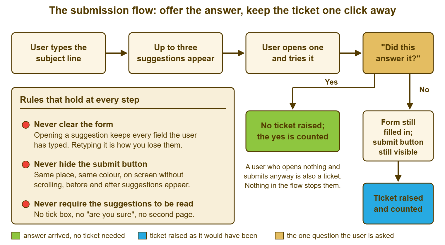
Read the picture for what is absent as much as what is present. There is no step between "No" and "Ticket raised" except the button the user was already going to press. There is no gate before the suggestions appear and no gate after. There is no path on which the user ends up with neither an answer nor a ticket. A flow with any of those things on it is one of the three fakes this series opened with, drawn with nicer arrows.
Testing It on Three Colleagues
Before the form goes live, hand it to three people who do not work on the desk, give each a real problem from last month's queue, and watch them without speaking. Time them from opening the form to either clicking "yes, this answered it" or pressing submit. The target is under a minute for either outcome. Note where they hesitate, where they scroll, whether they notice the suggestions at all, and whether they can find the submit button after opening one. Three people is enough to find the obvious faults. The method, with the sheet to record it on, is the same hallway test used for articles in Testing Articles on Real Users.
Watch especially for the colleague who opens a suggestion, reads it, and then cannot find their way back to the form. That is the single commonest fault in a suggestion flow and it is invisible from the desk's side, because the desk knows where the form went. Watch also for the colleague who ignores the panel completely and submits in forty seconds. That is a success, not a failure. If the flow made it harder for them than the old form did, the flow is wrong. Then repeat the test on a phone, with the same three problems, because the form that passed on a monitor often fails there.
Repeat the test a month after going live, with the same three colleagues and three new problems, because the first month changes things. Titles get retitled, suggestions start matching different articles, and somebody will have added a required field in the meantime. The test is twenty minutes. The month of phone calls it prevents is not.
A Short War Story: The Tick Boxes at Meridian Parts
At Meridian Parts, a desk lead called Lucas switched on suggested articles for the request form. Worried that nobody would read them, Lucas added a tick box to each suggestion reading "I have checked this article". Lucas made the form refuse to submit until all three were ticked, with the submit button moved beneath the panel to make the order clear. Within a fortnight the stores team had stopped using the form and were e-mailing a technician called Priyanka directly. She had once helped them and her address was in their sent items. By the end of the second month she had sixty-one requests in her personal inbox that had never become tickets. The form's report showed a fall in volume that Lucas had presented as deflection. One of the sixty-one was a purchase order that could not be released because the approver's account was locked. It sat in Priyanka's inbox over a weekend while she was on leave. It cost the company a supplier's early-payment discount and a very long Monday. The tick boxes came off, the button went back above the panel, and Priyanka forwarded sixty-one e-mails into the queue, one at a time. A suggestion the user is forced to acknowledge is not read; it is ticked, resented, and routed around.
The Submission-Flow Design Sheet
The sheet below is the design for the point of submission on one page. It works whether your portal shows suggestions as the user types or you are building the same flow by hand with the acknowledgment and the first reply. Fill in the top section for your form, tick the rules you can verify today, and use the test section before going live and again a month after. The "if your portal cannot suggest" block is not a lesser option; it is the same flow with the answer arriving a step later. Most small desks will fill in that block and nothing else.
THE SUBMISSION-FLOW DESIGN — ONE PAGE
Desk: ______________________   Form: ______________________   Owner: ______________

1. THE FORM AS IT IS TODAY
   Required fields (list every one): ______________________________________________
   Can every user answer each in under ten seconds?   [ ] yes   [ ] no: remove ______________
   Submit button visible without scrolling on the smallest screen in use?   [ ] yes   [ ] no
   E-mail address and phone number shown on the form page?   [ ] yes   [ ] no

2. SUGGESTIONS (if the portal shows them as the user types)
   Shown beside or beneath the subject box, never between the last field and the button   [ ]
   Maximum shown: ____ (three or fewer)
   Titles in the user's words; last hundred subject lines checked against them   [ ]
   Opening a suggestion keeps every typed field and returns to the same form   [ ]
   Article opens on the first thing to try, within one scroll   [ ]
   One question after reading: "Did this answer it?"  yes / no, one click, optional   [ ]
   Yes count and no count recorded per article   [ ]

3. RULES THAT HOLD AT EVERY STEP
   [ ] Never clear the form
   [ ] Never hide, move, grey out or push down the submit button
   [ ] Never require a suggestion to be read, ticked or acknowledged
   [ ] Never add a confirmation dialog or "are you sure?"
   [ ] Never remove another door (e-mail, phone) to push people to the form

4. IF THE PORTAL CANNOT SUGGEST
   Acknowledgment carries one line and one link for the commonest request type   [ ]
   Acknowledgment ends with: "If that worked, reply 'fixed' and we will close this."   [ ]
   First human reply within ______ for tickets an article answers, with the link only   [ ]
   Invitation line above the form: "Searching first often answers it; the form is below."   [ ]

5. TEST BEFORE GO-LIVE AND ONE MONTH AFTER
   Tester    Problem given                 Found suggestion?   Found submit after?   Time to yes/submit
   _______   __________________________   [ ] yes [ ] no       [ ] yes [ ] no          ____ s
   _______   __________________________   [ ] yes [ ] no       [ ] yes [ ] no          ____ s
   _______   __________________________   [ ] yes [ ] no       [ ] yes [ ] no          ____ s
   Repeated on a phone   [ ]      Faults found: _________________________________________

6. WATCH FOR THE MONTH AFTER GO-LIVE
   Form tickets: ____   Phone: ____   Walk-ups: ____   E-mails to technicians: ____
   Yes clicks: ____   No clicks: ____   Articles with most "no": ______________________
Section six is the part that catches a wall the tests missed. A fall in form tickets with a rise in the other three columns is the tick-box story at Meridian Parts, told in numbers. It shows up within a month if anyone looks. Raj at Stonebridge looks every Friday. The week Ana clicked yes, the sheet said fourteen yeses, nine noes, phone calls level. The article with the most noes was one about the expenses system, which he sent back to its owner with a note. That is the whole feature, working: an answer offered, a count kept, and nobody standing in a doorway.
Frequently Asked Questions
Our portal cannot show suggestions as the user types. Is this article still for us?
How many suggestions should the form show?
Should we ask users to search before they can open the form?
What if a user clicks "yes, this answered it" and then raises the ticket anyway?
Can suggestions and required fields be rolled out together?
How soon after going live will we know if the form is blocking people?
From the QuerySolv team: we build self-hosted help desk software for Windows. QuerySolv runs as one Windows service on your own network. It takes requests by web form, e-mail, live chat, social messages and REST API. It is licensed once per installation rather than per agent per month. The free trial runs the full product for 30 days.