
When a Picture Beats a Page of Steps, and When Text Wins
Tuesday, 08:50, at Harbourview Clinic. The label printer on the reception desk has run out. There are nine patients in the waiting room. Nadia has the knowledge base article open on her second screen: "Reloading the label printer". It has eleven steps, written by the desk two years ago and correct in every particular. Step four says "turn the blue lever towards you". There are two blue levers. She turns the one she can see. The roll jams. At 09:04 a ticket arrives at the desk: "Label printer jammed, I followed the article." Priya walks over from the desk, opens the printer, lifts the lever that is hidden under the lid, and reloads it in forty seconds. "Oh," says Nadia. "That lever." The eleven steps were right. They were the wrong format.
A visual guide is any piece of help that shows rather than tells: a photograph of the device, an annotated screenshot, or a short video of the screen or of someone's hands. An annotated screenshot is a still picture of the screen with a mark on it saying where to look. Each format does a job that text does badly, and each one costs more than text to make and far more to keep true. The question this article answers is which format fits which task. The instinct is to pick the format the author likes making, and the reader did not choose the author. This article is part of our Visual & Video Guides series, which covers choosing, making and keeping the pictures and videos in a help desk's knowledge base.
It covers the three formats and the one thing each is good at. Next come where a picture wins, on spatial tasks and on unfamiliar screens, and where video wins, on sequences of many small moves. Then come where text wins, and why it is the default, and what each format costs to make and to keep, in a table. The four questions in order follow, with a picture of the flow, then mixing formats inside one article. A short war story and the format decision table to copy finish the article, in that order.
Three Formats, Each Good at One Thing
A picture shows where, text says what, and video shows how a sequence moves. That is the whole argument, and the rest of this article is that sentence taken apart. Text steps are a numbered list of actions with the names and values the reader needs: "Click Save. Type the printer's name: RECEPTION-LABEL-1." A picture, whether a photograph or a screenshot, answers the question "where?" when the words for where are longer than the action itself. A video answers "how does it move?" when the task is a chain of small motions in a strict order and the reader cannot hold eight positions in their head at once.
The knowledge base is where all three live. It is the set of articles the desk publishes that answer the questions the desk gets asked more than once. Some are for users and some only for technicians. Most of what is in it should be text, and most of what people put in it when they discover screen recording is video. The gap between those two sentences is where the tickets come from. Nadia's eleven steps were text describing a lever, which is a space question. No number of extra words would have told her it was under the lid. One photograph would have.
Formats are not better or worse; they are better or worse at particular things. The particular thing is set by the task, not by the author. A technician who enjoys recording will record the password-change procedure, which should be text. A technician who enjoys writing will write eleven steps about a lever. Both are doing careful work in the wrong medium, and the reader pays for it at 08:50 with nine patients waiting.
Where a Picture Wins: Spatial Tasks
A spatial task is one where the hard part is where something is, which way it faces, or which of two similar things to touch. Reloading a printer. Plugging a dock into the right port on a laptop that has three the same shape. Finding the reset hole on the back of a desk phone. Seating a handheld scanner in its cradle so the contacts meet. Pressing the right button on a meeting-room panel the visitor has never seen. Words are bad at space. "The second port from the left on the back, below the one with the green light, not the one with the lightning symbol" is a sentence the reader has to translate into a picture in their head. The translation is where the error creeps in.
For a physical thing, the picture is a photograph taken on the phone's camera, and one photograph per position is the rule. If the task has three positions, the lever, the roll, the lid, it is three photographs, each with one arrow, in the order the hands go. Put a hand in the shot where it helps with scale and orientation. A photo of a printer's innards is a puzzle. A photo of a thumb lifting the lever is an instruction. Printers, I am convinced, were designed by people who never had to describe one over the phone.
The test for a spatial task is in the draft itself. Write the steps in text first, then count the words "left", "right", "behind", "underneath", "next to" and "the other one". If they appear more than twice in a step, that step wants a photograph, and the words can shrink to "lift the lever shown below". The text stays, shorter, beside the picture. The picture does not replace the step; it replaces the paragraph of directions inside the step.
Where a Picture Wins: The Unfamiliar Screen
An unfamiliar screen is one the reader has never seen before, and the problem on it is orientation, not action. Tell someone who uses their mail every day to "open the signature settings" and they will manage. Tell a new starter the same thing on their first morning and they are looking at a window with forty controls. They have no idea which corner holds settings, and the article assumes they know. One annotated screenshot, the whole window with a single box around the control that matters, turns forty things into one. The step beneath it still says what to click. The screenshot says where.
The decision about which screenshots help a written article and which merely decorate it belongs to Screenshots That Help, and the Ones That Do Not. The craft of drawing the box so that it is seen is in Annotated Screenshots Done Well. The format question here is narrower: does this reader know this screen? If the article is for the finance team about the finance system they use all day, no. If it is for anyone about a portal they visit twice a year, yes. The same task can be text for one audience and text plus a screenshot for another. The knowledge base can hold both.
The test is the length of the clause that locates the control. "Click Save" needs no picture. "Click the small gear icon in the top right corner of the panel on the left, below your name but above the folder list" is a step whose location clause is four times longer than its action. That ratio is the signal. When the where is longer than the what, screenshot the where and shorten the step to the what. One screenshot. Not one per step, which is a slideshow with captions and is kept current by nobody.
Where Video Wins: Sequences of Many Small Moves
Video earns its place when the task is motion. That might be a drag from one place to another, a key held while clicking, or a wait for a spinner that must finish before the next click. It might be a gesture on a touch panel, or a chain of eight clicks each on a different part of the screen in an order that matters. Text can describe all of that, and the reader can follow about four of the eight before losing their place between the article and the screen. A video of the sequence lets them watch it once, then do it with the video paused at the step they are on. The timing comes free: the reader sees how long the spinner spins.
Video also wins where the feel of the thing is the instruction. How long to hold the power button before the light blinks. How far to push the cable until it clicks. How fast to swipe on the panel. These are things a sentence can only approximate ("hold for several seconds") and a six-second clip conveys exactly. For a physical device the clip is shot on the phone's camera; for a screen it is made with a screen recorder. The discipline that keeps it to one task and one take is in The Ninety-Second Video.
Set the bar for video high. It is the most expensive format to make and by far the most expensive to keep true. Keeping it true is the subject of Keeping Media Current When Screens Change. A video is a promise that the screen still looks like that, and screens change on the vendor's schedule, not yours. So the rule is that video is used where text has been tried and the tickets kept coming, not where text would have worked and nobody wrote it. A video of someone typing a server path is a slow way of not being able to copy the path.
Where Text Wins: Searchable, Copyable, Quick to Update
Text is the default, and it is the default for four reasons that no picture can match. The first is search. The knowledge base's search, and the reader's own habit of typing a word into a box, find words. A text article about e-mail signatures appears when someone searches "signature". A video about e-mail signatures appears only if its title says so, and nothing inside it is visible to search at all. Every sentence of text is a door into the article; a video has one door, and it is the title.
The second is copying. Paths, server names, addresses, licence keys, a line to type into a box: the reader selects it from the text and pastes it, and nothing is mistyped. From a picture or a video they retype it, character by character, reading from a frame they have paused. Every character is a chance to turn a working path into a ticket. If the task contains anything the reader must reproduce exactly, that thing is text, whatever else the article is.
The third is updating. When the button moves, a text step is fixed in the time it takes to type the new name. A screenshot is re-shot, re-annotated and re-uploaded. A video is re-scripted and re-recorded. Screens change often. The format that costs a minute to fix is the one that will actually be fixed. The one that costs an afternoon waits for an afternoon that never comes.
The fourth is that text reads everywhere. On a phone in a stairwell, on a locked-down kiosk with no sound, through a screen reader for a reader who cannot see the screen, and in a print-out taped inside the printer lid. The reader who cannot watch is not a rare case. It is the person on the shop floor with the sound off. It is the person in the open-plan office who is not going to play audio at their desk. That reader is the subject of Accessibility: The Reader Who Cannot Watch. The rule that comes out of it is simple: never publish a picture or a video without text steps under it. The picture and the video are additions. The text is the article.
What Each Format Costs to Make and to Keep
The table below is the honest ledger. The column that matters most is the fourth, cost to keep current. The cost to make is paid once. The cost to keep is paid every time the thing being shown changes. For anything on a screen, that is more often than anyone expects. The last column is what each format looks like when it was chosen for the wrong task.
| Format | Good for | Cost to make | Cost to keep current | Fails when |
|---|---|---|---|---|
| Text steps | The what: actions, names, values; anything the reader must copy; anything likely to change | Minutes per step; no equipment | A minute per change | The reader cannot tell where on the screen or the device to act |
| Photograph | Physical position: which lever, which port, which button on the panel | The phone's camera and a minute per shot | Re-shoot when the hardware is replaced, which is rare | The thing is on a screen rather than in a room |
| Annotated screenshot | Orienting on an unfamiliar screen; one highlight at the hard step | A few minutes each, plus checking the frame for anything private | Re-shoot whenever the screen changes, which is often | Used at every step; private details left in the frame |
| Short video | Motion, timing, a sequence of many small moves in a strict order | A script, two rehearsals and one take; an hour the first time, less after | Re-record whenever the screen changes; the most expensive format to keep | Used for anything searchable, copyable or likely to change |
Read the table from the right. A format that fails when the task is "anything likely to change" has to be reserved for things that do not change much. The things that change least are physical devices and the motions of hands. That is why photographs and phone clips are the cheap end of visual guides and screen videos are the expensive end. The screen is the part of the organisation that gets redesigned by strangers every few months.
The Four Questions, in Order
The decision comes down to four questions asked in a fixed order. The picture below draws them left to right with a format under each. Is the task physical, a cable or a lever or a room? Then a photograph or a short phone clip. Must the reader copy something exactly, a path or an address or a line to type? Then text, whatever else is true, because the copyable thing can only live in text. Is the screen new to the reader, so that finding things on it is the hard part? Then text steps with one annotated screenshot at the step where they would otherwise get lost. Is it many small moves in a strict order, with timing? Then a ninety-second video with the text steps under it. If the answer to all four is no, it is text, and the article is finished sooner than you feared.
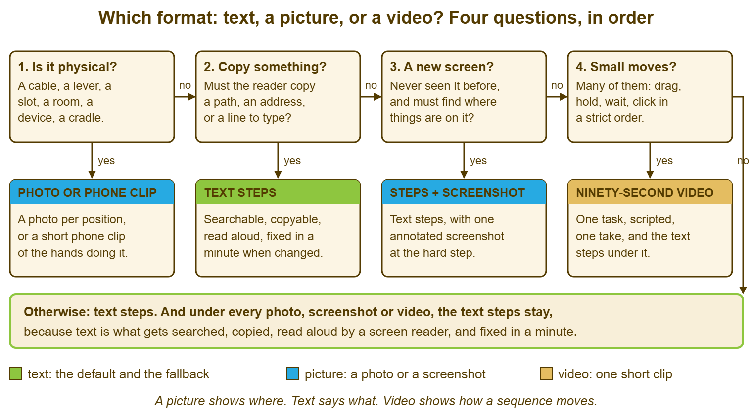
The order matters, and the reason is that each question overrides the ones after it. Physical comes first because no screenshot of a printer exists and no amount of screen recording will show a lever. Copying comes second because a video that shows a path being typed is worse than a sentence containing the path, however many small moves surround it. Put the path in the text. If the moves still need showing, the video shows them with the path already pasted in. The new-screen question comes before the many-moves question because a single screenshot is cheaper than a video and usually enough. The video is the answer only when the screenshot has been tried and the reader still cannot follow the sequence. Ask them in this order and the expensive answer comes up only when the cheap answers have genuinely failed.
Remember: a picture shows where, text says what, and video shows how a sequence moves. Text is the default, and text steps stay under every picture and every video, because text is what gets searched, copied, read aloud and fixed in a minute.
Mixing Formats Inside One Article
Most articles end up as text with one picture at the hard step, and the hard step is found by the tickets, not by the author's guess. When the desk reads "I followed the article and it jammed" three times, the step named in the third ticket is where the photograph goes. When a new-starter article produces the question "where is the gear icon?" twice in a month, that is where the screenshot goes. The format is added where readers fail, and nowhere else, because every picture is something to keep current. A picture at a step nobody struggles with is maintenance for no one's benefit.
Finding the failing step means being able to see the tickets about the article together, whichever way they arrived. A ticket from the web form, one from e-mail and one typed into chat are the same complaint about the same step. If they sit in three places they look like three stray grumbles. If they sit in one queue they look like a pattern. If you run QuerySolv, requests from the web form, e-mail, live chat and social messages all become ordinary tickets in one queue. So a search for the article's title finds every "I followed the article" at once. The step they share is usually visible in the first five. Whatever the tool, the habit is the same: before adding a picture, find the step the tickets point at.
When a video is justified, it goes at the top of the article with the full text steps beneath it, never in the middle and never instead of the steps. The reader who wants to watch watches; the reader who cannot scrolls past; the search engine indexes the steps. When a photograph is justified, it goes inside the step it illustrates, with the step text shortened to the action. What you do not do is produce all three: a video of the whole task, a screenshot at every step and the text. That is three copies of the same procedure and three things to update when the vendor moves a button. Pick the cheapest format that fixes the failing step, and stop.
The same task often deserves two formats for two audiences, and the knowledge base should be able to hold both without mixing them. The technician's runbook for the server cabinet can carry a photograph of the actual cabinet, rack numbers and all; the user's article about the same service carries no cabinet at all. If you run QuerySolv, the knowledge base already distinguishes articles visible to agents only from articles visible to everyone. So the cabinet photograph can sit in the first and never appear in the second. The split between those two documents is its own subject, in the Technician Docs vs User Docs series. Here, the point is only that "which format?" is asked once per audience, not once per task.
A Short War Story: The Forty Videos at Meridian Parts
At Meridian Parts, a distributor with a four-person desk, a technician called Gareth discovered the screen recorder on his workstation one January. Over the winter, he recorded a video for every article in the knowledge base, forty in all. They included "change your password", "set an out-of-office reply" and "find the shared drive". Each of those had been three lines of text that worked. In the spring the mail system had an upgrade that moved the settings menu. Twenty-six of the forty videos now showed a menu that no longer existed. Nobody knew which twenty-six, because nothing inside a video can be searched. The desk spent three Friday afternoons watching its own videos to find out. Meanwhile, tickets saying "the video shows a button I don't have" rose from none to a dozen a week. The three-line text articles, which had been left underneath as an afterthought, were fixed in a morning. Gareth re-recorded six videos, the ones for tasks with real sequences in them, and deleted the rest. The password article went back to being three lines, which is what it had always wanted to be. The lesson was not that video is bad; it was that a format chosen because the author enjoyed it is paid for by the reader, every quarter, forever.
The Format Decision Table
Use the table below when an article is being written or when the tickets say an existing one is failing. Find the row that describes the task, or the step within the task, and take the format in the second column. The third column says what goes with it. It is nearly always "the text steps", because they always do. Where two rows apply, the one higher in the table wins, which is the same order as the four questions. It is joke-free and short enough to pin above the desk.
| If the task, or the step, is... | Use | Always with | Do not |
|---|---|---|---|
| Physical: a lever, a port, a cable, a button on a panel, a slot, a room | One photograph per position, one arrow each, taken on the phone's camera | A one-line text step per photograph | Describe the position in words longer than the action |
| A motion on a physical thing: how far, how long, how hard | A phone clip of the hands, under fifteen seconds | A text step giving the best words for it ("until it clicks") | Rely on "several seconds" |
| Anything the reader must reproduce exactly: a path, an address, a name, a line to type | Text, in a form the reader can select and copy | Nothing else is needed for that step | Show it only inside a picture or a video |
| On a screen the reader has never seen, where finding the control is the hard part | Text steps plus one annotated screenshot at the step where readers get lost | The step text, shortened to the action | Screenshot every step |
| Many small moves in a strict order, with timing, where text has been tried and failed | A ninety-second video of that task only, at the top of the article | The full text steps beneath the video | Record the whole article; add music; add an introduction |
| Likely to change within a few months (vendor-hosted, newly deployed, under review) | Text, even where a picture would help today | A note on who re-checks it when the system changes | Invest in media that will be wrong by summer |
| For a reader who cannot watch: shop floor, sound off, screen reader, phone | Text first; any picture or video is an addition | Alt text on every picture; captions or a transcript on every video | Publish media with no text route to the same result |
| None of the above | Text steps | Nothing | Add a picture because the article looks bare |
Nadia's article at Harbourview is now four steps and three photographs. Each photograph shows a thumb on a lever with one arrow. The third one shows the lid lifted and the lever that hides beneath it. It took Priya twenty minutes on a Wednesday, most of it waiting for the printer to run out of labels so she could photograph it empty. The eleven steps are gone, and nobody misses them. Nobody has jammed the printer since, which is the only review a format decision ever gets.
Frequently Asked Questions
Can we record everything as video and skip the written steps?
How many screenshots should one article have?
What about short looping animations instead of a full video?
Our readers are often on a phone in a plant room. Which format is best for them?
Should the technician's runbook use the same format as the user's article?
How do we find out which step readers are failing at?
From the QuerySolv team: we build self-hosted help desk software for Windows. QuerySolv runs as one Windows service on your own network. It takes requests by web form, e-mail, live chat, social messages and REST API. It is licensed once per installation rather than per agent per month. The free trial runs the full product for 30 days.