
Designing the Wall Screen, If You Have One
Tuesday, 11:20, at Ashgrove Housing. Two people from facilities have just finished mounting a large screen on the wall of the support desk's room. The operations director, who approved it, would like "something on it by Friday". Fatima, who leads the four-person desk, remembers the last screen, in the old building. It ran a slideshow of charts from a reporting add-on, one chart at a time, changing every so often. At any given moment nobody knew what was on it. Nobody could have said what it had shown a minute ago. Rob, who has been on the desk longest, remembers it mostly as a light source. Fatima has until Friday to put up something the desk will still be reading in March. She knows, from the last screen, that the problem is not what to put on. It is what to leave off.
A wall screen is a large display in the desk's shared room that shows the team dashboard, the shared view of now. It is large enough to read from across the room without a mouse or a login. It is the same figures the desk already reads on its own screens, made bigger and stricter. It is bigger because it must be read from the door, and stricter because a wall has no scroll bar and no second page. So everything that does not earn its place pushes something that does. This article is part of our Team Dashboards series. This article is about the design of that one screen, for the desks that should have one, which is not all of them.
It covers whether you need a wall screen at all and six tiles readable from the door. Next come the six tiles themselves, with a picture and a table, followed by colour that means something. It covers what to leave off and setting the colour thresholds from your own figures. Then come the screen nobody looks at after a month, a short war story, and the wall screen layout to copy, in that order.
Do You Need One at All?
Most desks of one or two people do not need a wall screen, and should spend the money on a second monitor each. The shared view, the five live counts described in The Real-Time Queue View, is read on sitting down, after lunch and before leaving. Two people in one room who each do that, and who can see each other, have everything a wall would give them. A wall screen is a commitment: it has to be kept current, kept honest and kept read. And a screen that fails any of those is worse than no screen, because it teaches the desk that the shared figures are background.
A wall screen earns its place in three situations. The desk shares a room and runs shifts or a rota, so that the people in the room change. In that case, the figures need to be visible to whoever is there without anyone logging in. The desk has a walk-up counter, so that the figures are seen by the technician at the counter while their own screen shows the requester's ticket. Or the desk's room is passed through by the people who ask "is the desk coping?" A screen that answers that question in the time it takes to walk past saves the question being asked. Ashgrove had all three: a rota, a counter for tenants' housing officers, and a corridor to the kitchen.
A desk spread across sites or working from home has the same need and no wall. The answer is the same six tiles in a browser tab that each person keeps open on a second screen or a tablet. The design rules in this article apply unchanged, because the problem, one glance, one truth, is the same; only the font size changes. If you run QuerySolv, the dashboard already shows what is waiting and what is overdue. A wall screen is that view made bigger and stricter. The rest of this article is about the bigger and the stricter, on any tool.
Six Tiles, Readable From the Door
The design has one rule from which the others follow: six tiles, one number each, readable from the door. One number each because a tile with two numbers is read as a comparison and a tile with a chart is read as decoration. There are six because six fits a large screen in two rows of three with each number the height of a hand. Also, a desk of up to ten people has about six things worth knowing at a glance, as the next section argues. It must be readable from the door because the door is where the manager stands, and the counter is where the technician stands. Both are further from the screen than the person who built it was when they chose the font size.
Test the font size with your feet rather than your judgement. Put the draft on the screen, walk to the door, and read the numbers aloud; then walk to the counter and do the same. If any number needs a step forward, it is too small, and the fix is a bigger number, not a bigger screen. A tile, for the purpose of this article, is one rectangle with a label at the top and one large figure in the middle. It has a one-line subline under it and a colour band. That band says whether the figure is fine, needs attention, or is a broken promise. That is the whole anatomy. Anything else on the tile is competing with the number for the eye, and the number should win.
Six is a ceiling, not a target, and four is fine. The temptation on a new screen is to fill it, because an empty space looks like an oversight and someone will ask about it. The answer is that the space is where attention goes when a tile changes colour. A screen with four big tiles and two empty spaces is read. A screen with six tiles and a scrolling ticker of recent tickets is a television. (It will be watched like one, which is to say with the sound off and no memory of what was on.)
The Six Tiles
The picture below is Ashgrove's screen as it was designed on the Thursday. And it is the five counts of the queue view plus one tile for people. Across the top row: unassigned, with the age of the oldest in the subline; overdue; and due in the next hour. Across the bottom is waiting on us, meaning tickets the desk owns that have had no desk update for over a working day. Next is today's arrived and resolved, as information. Last is who is on the desk now, with who leads and when the next shift change is. Each tile carries a coloured band. The rule for the colour is printed on the tile. That lets a new technician or a passing director read why a tile is amber without asking. The numbers on the picture are from one ordinary morning at Ashgrove and mean nothing beyond that morning.
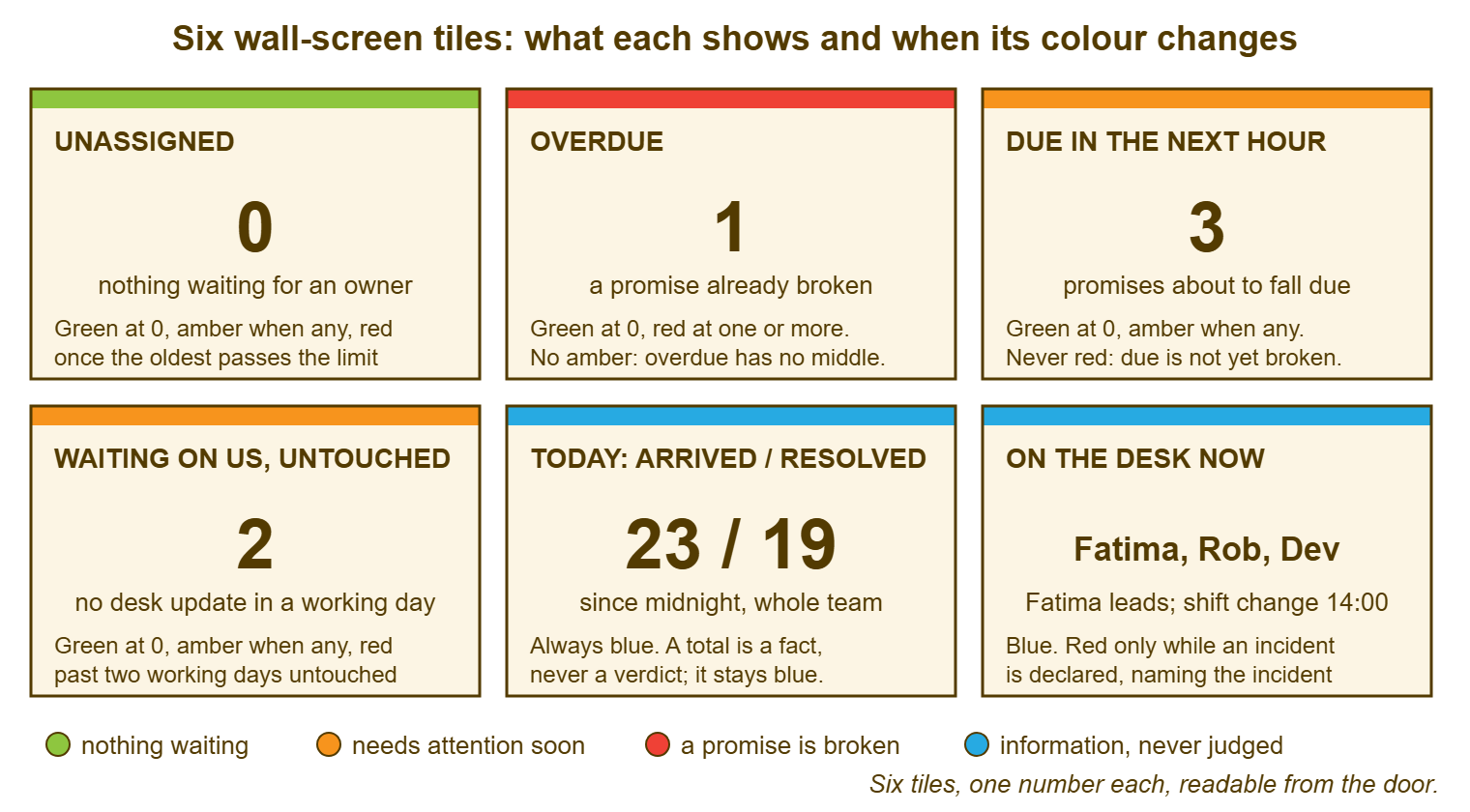
The table is the same six tiles as a specification: what each shows, where the figure comes from, the colour rule, and who acts when it changes. The source column matters more than it looks, because a tile whose source nobody can name is a tile nobody can check. Checking is the subject of Keeping Dashboards Honest. The thresholds in the colour column are Ashgrove's, from Ashgrove's tickets, and the section on thresholds below says how to get your own.
| Tile | What it shows | Source | Colour rule (Ashgrove's thresholds) | Who acts |
|---|---|---|---|---|
| Unassigned | Count; subline: age of the oldest | Open tickets with no owner, all desk departments | Green at zero; amber when any; red when the oldest passes thirty minutes in working hours | Whoever is free takes the oldest; lead if nobody is |
| Overdue | Count | Open tickets past their service-level target | Green at zero; red at one or more; no amber | Owner messages the requester within the hour; lead if owner away |
| Due in the next hour | Count | Open tickets with a target inside the next hour, not yet past | Green at zero; amber when any; never red | Lead confirms each owner knows |
| Waiting on us, untouched | Count | Owned, active status, no desk update for over one working day | Green at zero; amber when any; red when the oldest passes two working days | Owner touches it today or hands it over |
| Today: arrived / resolved | Two counts since midnight | Tickets created today; tickets resolved today | Always blue; information, never judged | Nobody; the lead reads it for the day's weight |
| On the desk now | Names; subline: who leads, next shift change | The rota, kept by the lead | Blue; red only while a major incident is declared, naming it | Whoever is named |
Notice what the sixth tile is not. It is not a per-person count, not a list of who holds what, not anybody's closed figure. It is names and a time, which is what "who is free?" needs on a desk of ten or fewer. It is also the tile that becomes the incident banner when one is declared. That is the only time the wall screen should ever shout. A per-person figure on a wall is a ranking whatever it is called. And the damage it does is set out in Dashboards That Motivate Instead of Surveil; the sixth tile is the honest alternative.
Colour That Means Something
Colour on a wall screen is a language with four words. Every tile uses the same four with the same meanings or the screen cannot be read from the door. Green means nothing is waiting and no action is needed. Amber means something needs attention before the next read. Red means a promise is already broken. Blue means information: a figure that is true, useful and carries no judgement, so it never changes colour. A screen that uses those four consistently can be read in one second from across the room without reading a single number. And that one second is most of what a wall screen is for.
The rules that follow from the four words are short and should be kept. Overdue has no amber, because a promise is either kept or broken and a middle colour would suggest otherwise. Due soon has no red, because a ticket that is not yet late is not yet a failure. Colouring it red teaches the desk that red is sometimes fine. Totals are always blue, because a total coloured green or red is a verdict, and the day's arrivals are nobody's fault. Nothing is coloured for decoration: no brand colours, no gradient, no tile that is purple because purple was available. A colour that means nothing teaches the eye that colours mean nothing, and the red tile pays for it.
Pair every colour with a word, because some of the people reading the screen will not see the colours the way the designer did. A label is also what makes the colour checkable. The band says red; the label says OVERDUE; the rule printed on the tile says why. A person who cannot tell the green band from the red one can still read the word and the number. And a person who can tell them apart has the word to confirm what the colour claimed. Shape helps too, where the tool allows it: a solid band for red, a hatched one for amber, nothing for green. Never let colour be the only carrier of meaning on a screen that is meant to be read in a second.
Remember: use six tiles at most, one number each, readable from the door. Use four colours that always mean the same thing. Green is for nothing waiting, and amber for attention needed. Red is for a promise broken, and blue for information that is never judged.
What to Leave Off
Leave off every per-person figure, because a wall is public and a per-person figure on it is a ranking. The previous article in this series is the long form of that sentence. Leave off averages, because an average on a live screen is either noise or a report, and the eye learns to skip it either way. Leave off month-to-date totals other than today's arrivals and resolutions, because they belong in the monthly report where somebody will read them with the time to think. That is described in The Monthly Report They Will Actually Read. Leave off charts of any kind, because a chart is read in ten seconds and a wall screen is read in one. A chart that cannot be read in one second is a picture.
Leave off the things that arrive as requests in the first month, each of which is reasonable alone. The scrolling list of recent tickets, which turns the screen into a television. The satisfaction gauge, which is a monthly figure wearing a speedometer. The logo, the weather, the news feed, the clock the size of a tile, the photograph of the team. Each takes a tile or a corner from the six. Each is looked at instead of the overdue count for the first week. And each is wallpaper by the second. The request to add "one more graph" is answered with one question. What would anyone on the desk do differently in the next hour if that graph changed? If the answer is nothing, it is a report, and the person asking is offered the report.
Leave off, finally, the things that are true and alarming and not actionable from the desk. The count of open tickets across the whole organisation, when the desk covers only part of it. The age of the oldest ticket anywhere, when the oldest is a project request waiting on a budget. A number the desk cannot change by doing something in the next hour is a number the desk will learn to live beside. Once the desk has learned to live beside one alarming number, it has learned the skill for the rest. Wall screens are good teachers. Choose the lesson.
Thresholds Are the Desk's Own
Two of the six tiles need thresholds, the points at which the colour changes. The thresholds come from your own tickets, never from this article or anywhere else. The method is a month of looking. For the unassigned tile, note how long unassigned tickets actually waited before someone took them, and at what age a requester phoned to ask. The amber point is "any", and the red point sits where the phoning starts. For waiting on us, read a month of complaints that began "I haven't heard anything" and note how long the silence had been. The red point sits a little before that. Ashgrove's figures, which are a worked example and not a recommendation, came out at thirty minutes for red on unassigned. That was because housing officers at the counter began asking after about that. Ashgrove's figures came out at two working days for red on waiting on us, because tenants' complaints about silence began at about three.
Set the thresholds so the screen is mostly green and occasionally not, because a screen that is always amber is a screen the desk has stopped reading. If a tile is amber every morning, either the threshold is wrong for how the desk works or the desk has a standing problem. In the latter case, the tile is correctly reporting the problem. A week of opening the tile's list each morning tells you which. Do not move the threshold to make the colour comfortable; that is a thermometer being adjusted to improve the weather. If the figure is right and uncomfortable, the conversation is about staffing or promises. That conversation belongs with whoever signed the service levels, which is a different article and a different meeting.
Write the thresholds on the layout and on the tile itself, and review them quarterly. The desk that grows, adds a shift, takes on a new department or changes its service-level targets will find its thresholds wrong within a month. And a threshold printed on the tile is one that a new technician can question and an old one can defend. A threshold that lives only in the dashboard's settings is a threshold nobody chose. And the colour it produces is a colour nobody can explain.
The Screen Nobody Looks At After a Month
Every wall screen is read intently for a fortnight and ignored by the sixth week unless something is done about it. The something is not a redesign. People stop seeing what does not change, and a well-run desk's screen is mostly green and mostly still. So the desk learns to see past it the way it sees past the fire-exit sign. The colour changes are what keep it alive, which is one more reason to set the thresholds so that amber happens. The fixed reads are the other. The lead reads the six tiles aloud, from the door, at the start of the day and after lunch, in one breath. "Zero unassigned, zero overdue, two due before eleven, one waiting on us, who has it?" takes four seconds and makes the screen part of the day rather than part of the wall.
Test whether the screen is alive with one question, asked of a technician who is facing away from it: what does the overdue tile say right now? A desk where most people can answer within one is a desk reading its screen. A desk where nobody can, and somebody turns round to check, has a screen that has become furniture. The fix is the reads aloud and a review of whether the six are the right six. If nothing else works, move the screen to the wall people face. A screen behind the desk is a screen for visitors. The desk needs it in front.
Change the screen when the desk changes and not otherwise. A new department, a new shift, a new target changes what the six tiles should be, and the quarterly review catches that. A redesign for its own sake, a new layout because the old one had been up for a while, costs the fortnight of relearning. It buys nothing. A screen that changes often is one that nobody trusts to mean the same thing twice. Stability is a feature. The best wall screen I have seen had been the same six tiles for three years. And the desk could have drawn it from memory, which was exactly the point.
A Short War Story: The Forty-Panel Screen at Acme
At Acme, a manufacturing firm with a five-person desk, a manager called Stefan had put up a wall screen. Stefan used every panel the ticketing tool's dashboard offered, which came to forty, arranged in a grid of small rectangles in eight colours. The refresh was fast enough that something on it was always moving. The desk admired it for a week and then stopped looking. Nothing on it could be read from further than a metre, and the colours meant eight different things in eight different panels. In the second month a ticket from the payroll team, about an export that would not run, went past its target on a Tuesday. It sat in the small red "Overdue" panel, between a satisfaction gauge and a bar chart of tickets by source, for nine working days. Then the payroll manager escalated by walking to the desk and standing at the counter. Payroll had run late for the whole company by two days. The finance director had asked why the desk had a screen if it did not read it. Stefan had spent an afternoon explaining that it had been on the screen the whole time, which was true and was the problem. The cost was one late payroll and about twelve hours of catch-up and apology. It also included a screen that was taken down and replaced with six tiles the following week. A red panel nobody can read from the door is not an alarm. It is a detail.
The Wall Screen Layout
The layout below is the six tiles as a one-page specification, filled in once and pinned beside the screen. It has a line for each tile's source, threshold, colour rule and the person who acts. Section A is the grid, in the positions on the screen. Section B is the colour language, which is the same on every tile and is written once. Section C records the font-size test, because "readable from the door" is a claim that should have a date on it. Section D is the list of things left off by decision, so that the first "can we just add" is answered by a document rather than a conversation.
WALL SCREEN LAYOUT — ONE PAGE
Desk: ______________________   Room: ______________________   Prepared by: ______________   Date: ____________

A. THE GRID (two rows of three; a blank is a blank, not a gap to fill)

   TOP LEFT: UNASSIGNED              TOP MIDDLE: OVERDUE                TOP RIGHT: DUE IN THE NEXT ____
   Shows: count                      Shows: count                       Shows: count
   Subline: age of the oldest        Subline: oldest by ____            Subline: next due at ____:____
   Source: open, no owner,           Source: open, past target          Source: open, target inside the
     departments: ______________                                           window, not yet past
   Green 0 / amber any /             Green 0 / red 1 or more /          Green 0 / amber any /
     red oldest past ____              no amber                           never red
   Acts: whoever is free; lead       Acts: owner; lead if away          Acts: lead confirms owners know

   BOTTOM LEFT: WAITING ON US        BOTTOM MIDDLE: TODAY               BOTTOM RIGHT: ON THE DESK NOW
   Shows: count                      Shows: arrived / resolved          Shows: names
   Subline: oldest untouched ____    Subline: since midnight            Subline: lead ______; next change ____:____
   Source: owned, active, no desk    Source: created today;             Source: the rota
     update for more than ____          resolved today
   Green 0 / amber any /             Always blue; never judged          Blue; red only while a major
     red oldest past ____                                                 incident is declared, naming it
   Acts: owner touches or hands over Acts: nobody; lead reads weight    Acts: whoever is named

B. THE COLOUR LANGUAGE (the same on every tile)
   Green = nothing waiting        Amber = attention before the next read
   Red = a promise is broken      Blue = information, never coloured as good or bad
   Every colour is paired with its word on the tile. No colour is used for decoration.

C. THE FONT-SIZE TEST
   Read aloud from the door by: ______________ on ____________   [ ] every number, no step forward
   Read aloud from the counter by: ______________ on ____________   [ ] every number, no step forward

D. LEFT OFF BY DECISION
   [ ] any figure by person   [ ] averages   [ ] month-to-date totals   [ ] charts and gauges
   [ ] scrolling ticket list   [ ] logo, clock, weather, news   [ ] figures the desk cannot act on within the hour

E. READS AND REVIEW
   Read aloud by the lead at: ____:____ and ____:____      Thresholds reviewed: ____________ (quarterly)
   "What does the overdue tile say?" asked of someone facing away, monthly: answered without looking [ ]
Fatima put the six tiles up at Ashgrove on the Friday. She read them aloud from the door with the operations director standing beside her. The director's only comment was that he could read them, which from a director is applause. The slideshow screen in the old building was never mentioned again except by Rob, who said the new one was less use as a light. The first threshold review, a quarter later, moved the unassigned red point from thirty minutes to forty-five. That was because the counter had been quieter than the month of watching had suggested. The screen is otherwise unchanged, and the desk can draw it from memory.
Frequently Asked Questions
Our tool's dashboard cannot be laid out as six big tiles. What then?
Should the wall screen show the requester names or ticket subjects?
How do we show a major incident on the wall?
We have two desks sharing one room. One screen or two?
What happens to the screen when the figures stop updating?
Is a tablet on the desk a reasonable substitute for a wall screen?
From the QuerySolv team: we build self-hosted help desk software for Windows. QuerySolv runs as one Windows service on your own network. It takes requests by web form, e-mail, live chat, social messages and REST API. It is licensed once per installation rather than per agent per month. The free trial runs the full product for 30 days.